
A first website for a home-based breathwork and yoga studio in Toronto.
A full custom site for a home-based breathwork and yoga studio in Toronto, built for speed, local search, and a calm buyer experience.
PROOF SO FAR
Launch-stage proof from the live deployment. Lighthouse and Core Web Vitals numbers reflect the first measured production build. Organic visibility, review signals, and inquiry volume will be evaluated after the site has had time to index, earn trust signals, and receive real search traffic.
Visit the live site(opens in a new tab)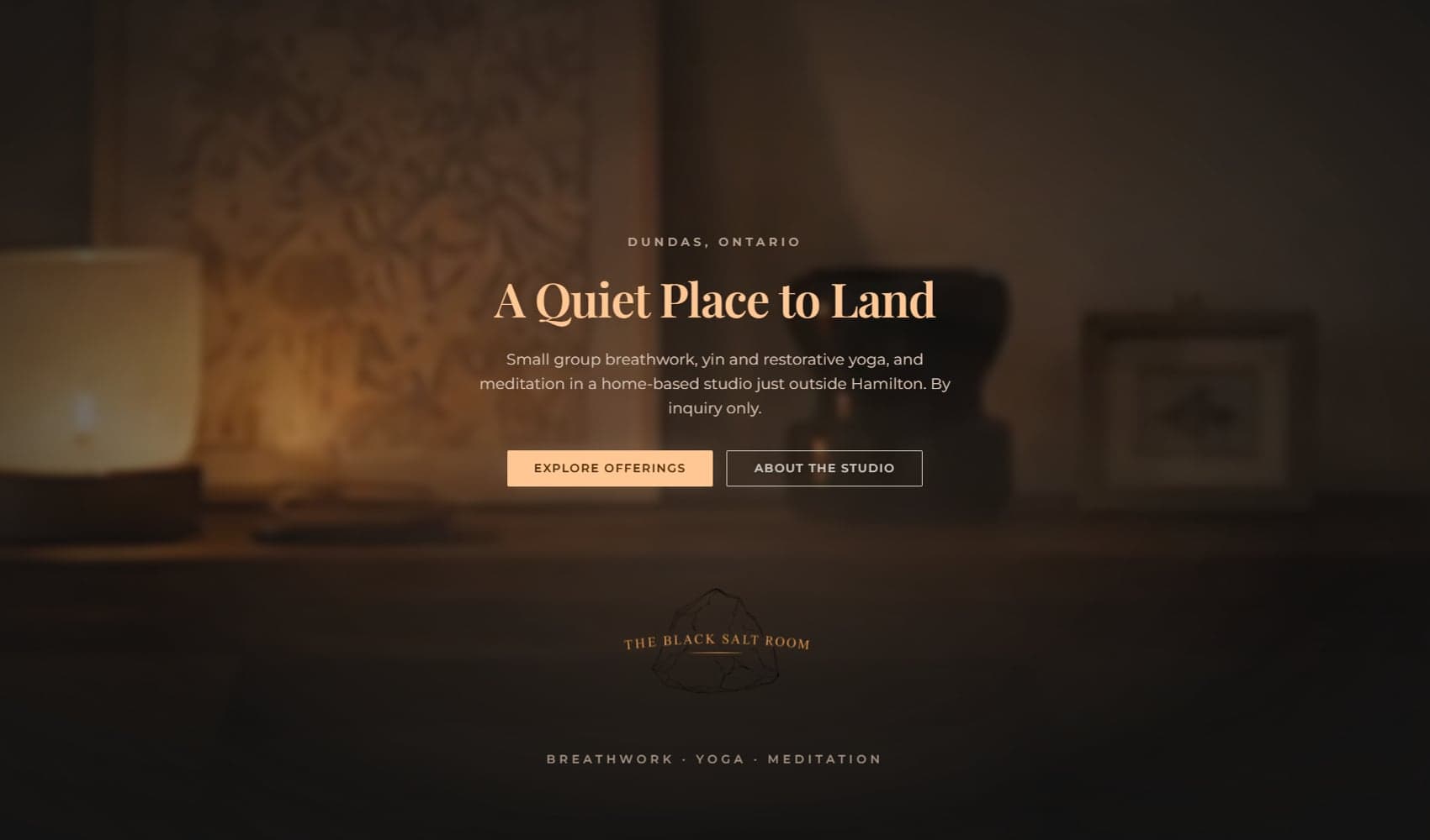
The situation
The Black Salt Room is a small home-based breathwork and yoga studio in Toronto, run by Alina. Before this project there was no website. New clients found her through word of mouth, and the people that referral didn't reach had nowhere to learn about the space, see what she offered, or quietly decide whether it felt like the right fit before reaching out.
The site had to stand next to the bright-spa yoga studios nearby and feel nothing like one. Polished and trustworthy on the surface, quiet and specific underneath. The atmosphere is the offer, and the site needed to read that way before anyone read a word. The brief: end-to-end web design for a wellness brand that needed to feel quiet and confident, an inquiry-first build that matched how the studio actually runs, and hyperlocal SEO that put Toronto and the GTA on the map before launch.
The build
Brand-led visual system
A dark candlelit palette, serif headings, clean supporting type, a hand-drawn salt-rock mark, and a subtle texture layer underneath it all. The goal was warm, specific, finished, and as far from the usual wellness-site look as the budget would let us push.
Atmospheric hero, reduced-motion-aware
The homepage carries a small ambient hero video with a still image loaded first, so the calm shows up immediately and the motion arrives only once the page is ready. The video is lazy-loaded and turned off entirely on mobile, save-data, and reduced-motion settings, so atmosphere never costs performance or accessibility.
Inquiry-only funnel, not a booking calendar
Every CTA on the site leads to the same contact form. The area-of-interest field pre-fills based on the page someone came from, so the form already knows a little about why they reached out. The site stayed focused on the first visit: service context, trust, and a simple path to inquire.
Five hyperlocal service pages
Each core offering got its own page: breathwork, yin, restorative, meditation, and private sessions. Visitors land closer to the thing they're actually looking for, and search engines get more specific local signals for Toronto and the GTA. The local SEO structure shipped with the launch instead of being parked as a later phase.
An inquiry form that cannot lose a submission
If every inquiry has to go through one form, that form cannot drop a submission. Submissions are validated, protected from basic bot traffic, rate-limited on the server, and written to a server-side log before email delivery even runs. The studio gets a safer intake path without renting a third-party booking platform.
Decisions that mattered
Decision 01. Inquiry-only, not a booking calendar.
A booking calendar would have changed the way Alina takes on new clients. The better fit was a simple inquiry form where someone can say what they are looking for before any session gets booked. The first step stays personal, the site doesn't get harder to use, and nobody books their way into the wrong service.
Decision 02. Hyperlocal SEO, not generic SEO.
The SEO work focused on the searches that actually matter for a small studio in a specific city. Instead of stacking every service onto one page, each offering gets its own local page with structured data underneath it. The site is clearer for visitors, and search engines get a real understanding of what the studio offers and the places it serves.
Decision 03. Atmosphere as the offer.
The site needed to feel calm and personal without ever reading as unfinished. Low-light imagery, a restrained palette, serif type, and a slower pace through the page made it feel specific to The Black Salt Room instead of like another wellness template dressed up.
What it moved
Before the project, The Black Salt Room had no website, no local service pages, and nowhere for referrals or search visitors to actually land.
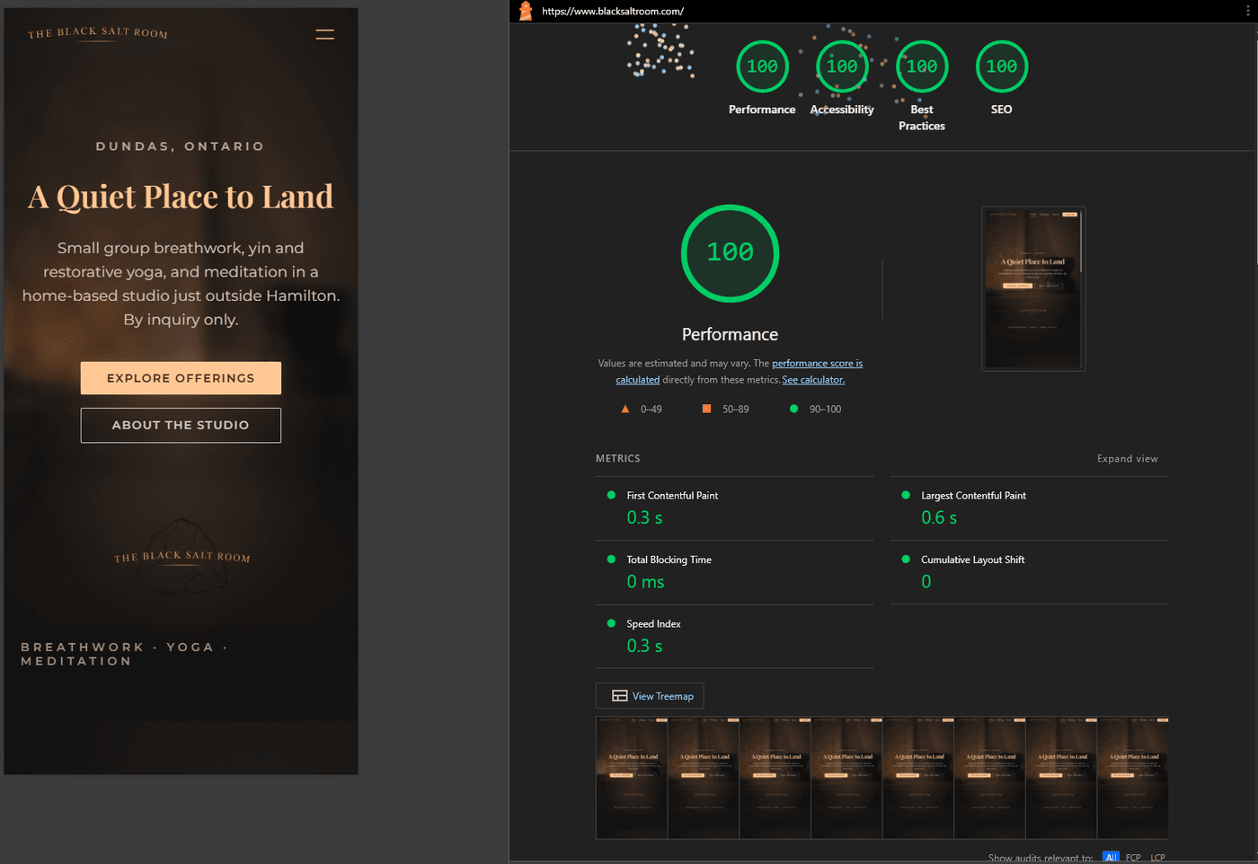
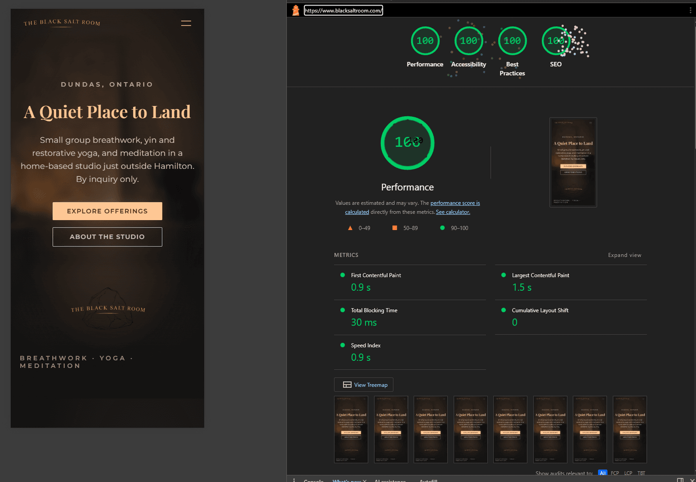
At launch, the studio had a custom website, five service pages built around local intent, one inquiry path, structured local SEO signals, and a live form taking real submissions. The site launched with Lighthouse 100 across Performance, Accessibility, Best Practices, and SEO on both mobile and desktop. Cumulative Layout Shift held at zero. Total Blocking Time held at zero on desktop and stayed under a single frame on mobile. First and Largest Contentful Paint came in well under the thresholds Google treats as "fast" on both devices. The ongoing cost is the domain.
Stack
Built with Next.js, TypeScript, Tailwind, optimized media, self-hosted fonts, and server-rendered pages wherever the page didn't need anything else. JavaScript runs only where it earns its place: the form, the mobile drawer, the FAQ accordion, and the hero video. The result is a custom site that loads quickly, stays accessible, and isn't quietly renting anything from a theme marketplace.
Security headers at the edge (HSTS, X-Frame-Options, Referrer-Policy, Permissions-Policy). A one-year immutable cache on static assets. AVIF and WebP image variants through next/image. Self-hosted fonts through next/font, no Google Fonts CDN. Semantic HTML with ARIA landmarks. WCAG AA contrast verified across the palette. Full keyboard navigation. prefers-reduced-motion honored everywhere.
What it set up
The launch gives the studio something to build on. From here the work moves into a Google Business Profile, review collection, local content shaped around the questions clients are already asking, and updated photography from the actual space. Each layer stacks onto the same site structure without dragging in platform costs. The shape of this engagement is the kind of work the studio takes on in boutique wellness more broadly.
If you run a B2B service firm and want a similar build that holds up to a skeptical buyer, see B2B service websites. If you want a quick, practical read on the site you have now, request a website review.
I had no website before this, so I didn't know what to expect. I didn't want the site to feel busy or salesy. I wanted it to feel warm, grounded, and like people could relax a little when they landed there. Alex really understood that. The finished site feels like my space, and that means a lot.
Alex made the whole thing feel easy.